








One of the most iconic and globally-recognised brands, Coca-Cola, is undergoing a branding refresh. The company has unveiled a bold new identity to streamline brand consistency across the globe in over 200 markets.
A major element of the brand refresh is the Coca-Cola ribbon, which was introduced in 1969 to unify the brand’s main design elements.
Over the years, this ribbon became witness to the brand’s expansion to new packaging formats, new product lines and new markets.
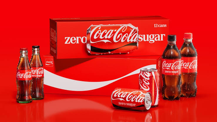
Now, the branding refresh has given the iconic ribbon a whole new identity, further unifying and amplifying core brand assets spread across the digital ecosystem, retail experiences, and equipment and packaging.
Further, Coca-Cola Zero Sugar has been given a prominent place in the new identity rollout. The product’s branding now comes in bold typography, with a black ribbon across the cans and black caps on PET bottles.
For a brand that is available in 200+ markets, it is a challenge as well as an opportunity to have a cohesive global identity and messaging. And Coca-Cola has embraced it with all its might.
As of today, the new brand identity system has been activated across markets in Asia, the Middle East, Europe and Latin America, and it will gradually roll out to all countries where the brand’s products are distributed.